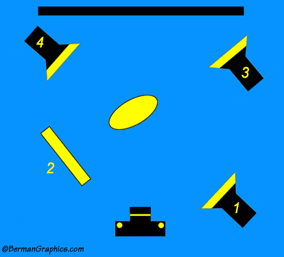
Light #1 is the main light positioned
at a 45 degree angle to the
subject.Reflector is #2 which can be replaced with a second light.
The ratio of light from #1 and #2 should be different. Light #1 (the main light)
is more powerful. The reflector should be the fill for a more
pleasing portrait. That's why the professional studio flash power packs
allow independent incremental settings for all attached heads. I'd suggest
starting with ratios of 1:2 or 1:3 and see what strikes you. But never
balance them so the light on both sides of the face is equal. That makes
for boring portraits.
Light #3 is pointed at the background. It's more preferable to let the
background be uniformly wrinkled for a more natural and pleasing portrait.
It could either be a hard circle to illuminate behind the head or a broad
soft light to light the background.
Light #4 is a hair light or rim light. it separates the hair from the
background making the portrait look more natural and lifelike. The rim
light should be elevated to look down on the hair. You don't want to do
the entire head, just the edge that meets the background in camera.
All of this is open to personal interpretation and artist judgments but
it'll give people a starting point when considering where to place the
lights. I usually bounce the main (and secondary light if I use one) into
a white umbrella to soften the light.


