|
Columbus Arts Festival 2011 Open Jury Review |
|
Jerry
Gilmore interview - Columbus juror |
|

|
|
other art show
juror interviews and jury reviews |
The process
1027 artists applied for 230 spaces. There
were a few changes this year to the way Columbus had previously held their
jury. Leah Alters, Columbus Arts Festival director changed the location to
a hotel in downtown Columbus instead of Upper Arlington. And instead of a
one round jury, they are now doing two rounds. Round one was to score yes,
no or maybe which were assigned numerical scores of 0, 1 and 2. That eliminated a little over half the applicants. For round
two, the artist statement was read and the jurors were instructed to score
1 through 7 and were free to discuss any issues they felt relevant. For
round one, the initial slide show preview by medium lasted approximately
three seconds followed by the scoring round which lasted approximately
eight seconds. Images were seen by the jurors in the order the
applications were submitted by medium.
Columbus now has an emerging artist category which is limited to local
counties around Columbus. |
| Because the artist statement wasn't
read until round two after half the applicants were already eliminated, it
speaks to how important your jury images actually are, especially when you
can't use words to describe them. |
|
Like previous open juries I've attended, not more than about a dozen
artists attended. This has always been an enigma since Columbus is
centrally located and within a few hours drive of thousands of artists
living in Ohio and surrounding states. It's always been the most
accessible of all the open juries. |
Charging the jurors
Because there were initial questions about
booth images, the jurors were given instructions about what was
acceptable, which was read from the show prospectus. No signatures on the artwork or names in the booth. No booth
created in Photoshop, which doesn't mean that booths can't be fixed or
adjustments can't be made using Photoshop. The jurors need to see the
entire booth, not just a portion. If artists don't have a booth picture,
they are required to submit a grouping of their work. Same goes for artists who
only have older work in their booth. They are also allowed to submit a grouping of new
work. If artists submit applications in more than one medium, they
can only display the work in the medium that they were accepted. |
| Donate to
BermanGraphics |
Observations
I attend open juries and write about issues
that can help artists create stronger presentations which will improve
their chances of getting into art shows. Tips from Columbus aren't much
different than what I've previously written about. |
|
For some reason there were two or three booth pictures where the booth was
in the center of the image and the surrounding parts of the picture faded
into white and blinded jurors, like edge or border effects on the image. |
|
Jewelry -
A white background on 3D work is a killer. A number of jewelers blinded everyone in the room by having
their work photographed on white, and you could hear the jurors grumbling
about it. And a few jewelers used distracting similar color backgrounds as
their work making it difficult to see where the piece ended and the
background began, especially in the few seconds the images were on screen.
Some images had a blue cast on the background because they hadn't been
color corrected yet.
And one jeweler showed close ups of a series of pendants on a models neck
and the blue veins in her skin were a distraction. Wearable fiber - Don't show the models face if
at all possible. And if you do, make sure the model looks like she's in a
good mood and make sure the skin color looks good. A number of fiber
artists submitted pictures with models with off color skin tones that were
distracting in the short time the jurors viewed the images. 3D mixed
media - installations or pictures of artwork taken outside in natural
settings. Make sure to use really shallow depth of field. Ideally have
your photographer shoot wide open with an f1.4 or f2.0 lens from close up
so that the background turns into a non distracting blur. Also, if you
include the sky in the upper portion of the images, even out of focus,
make sure it isn't white because it will draw the jurors eyes away from
the artwork. Shooting tip - The closer you position the camera to
the subject, the quicker the background falls out of focus.
Booth Images - During round two, booth issues were discussed. If
the individual art images didn't match what was in the booth, if the booth
looked cluttered, or if photographers only showed gallery wrapped canvases
in their booth instead of photographs framed under glass.
One photographer applied with three different sets of images under three
different names but used the same double booth slide and artist statement
for all three applications. He was caught when the jurors noticed the same
booth picture and questioned it.
These were some of the issues that were discussed. |
| In summary, the jurors had such a short
amount of time to view the projected images that having excellent
photography of your work with neutral matching backgrounds left the jurors
with a positive impression, or at least didn't give them the wrong reason
to give you a lower score. |
| Donate to
BermanGraphics |
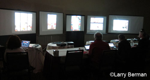
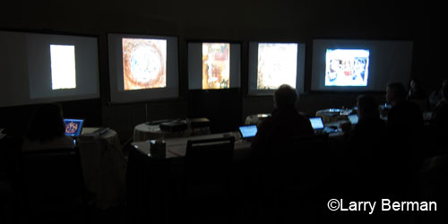
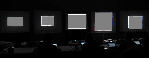
| A few pictures (below) of the jurors sitting
in front of the projected images. the room was too dark to retain detail
in both the projected images and the interior of the room. Scroll down to
see a better exposure of just the projected images when I under exposed
approximately two
stops. |
|
This is also why you can't see the artwork images for those shows that do
live video feeds of their juries. They need to use video cameras that can
be set to under expose between two and three stops to see the detail in
the brightly projected images, instead of averaging the exposure to
lighten the dark areas of the room. |
|

|
|

|
| The ZAPP image format problem (below)
a year and a half later. Ever since August 2009 I've been warning artists
not pay attention to the image formatting changes on the ZAPP web site.
Below is an example of what happens when you upload images smaller than
1920 into ZAPP system.
Three of the five images from this artist's presentation were uploaded to
ZAPP at 1400 pixels long dimension. ZAPP retains the uploaded size but
adds 1920 black borders to the images so they project smaller than
everyone else's images. I don't understand why they don't just resize
smaller size images up to the same size all the other images are,
eliminating this distracting problem. I've been suggesting that for as
long as they've been allowing smaller sized images into the system. |
|

ZAPP image format issue revisited
images covered to protect the identity of the artist
who uploaded images that were too small. |
|
If you are uploading images that are not the full 1920x1920, more
than likely it will work against you -
ask me why |
| Donate to
BermanGraphics |
|
art show
juror interviews and jury reviews |
|
Hire me
to Prepare your Digital Jury Images |


