|
Observing the 2009 Columbus ZAPP Jury
by Larry Berman |
|

|
|
scroll down to see
a few pictures |
|
other art
show jury reviews |
| An amazing experience, seeing beautiful jury
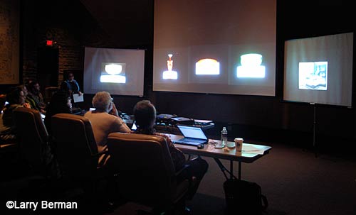
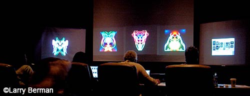
images from hundreds of artists projected five across in a room so quiet,
you could literally hear a pin drop. For years, I’ve been suggesting
artists attend one of these open juries because it’s the best investment
you can make in your art show career. |
| Disappointing though because fewer than about
fifteen artists attended. Columbus has always had an open jury and I’ve been writing about it in my newsletter and
posting about it on the art show forums. It
must be the passive aggressive nature of artists to keep applying to
shows, complain when they get rejected, but don’t know what their own or
their competitor’s images look like in a jury situation. Throughout the
day and a half process, I took notes on problems and ways to improve
presentations. |
| After the preview slide show per medium, the
images were projected for about 22 seconds while the artist statements
were read and the jurors entered their scores. Jurors were able to have
statements reread, see the images on screen for a longer time and had the
ability to ask for the images to be zoomed in to see detail. |
| Donate to
BermanGraphics |
| The Booth Slides |
| The clear weakness was booth slides. Though
the jurors were told to not make the booth image more than 10% of the
score, you couldn’t help noticing how bad some were. A lot of washed out
low contrast booth images, though the art images were clear with vibrant
color. A few had different work in the booth than in the art slides which
was explained by artists creating new work but not having enough time for
a new booth slide. Names in some booths and a few had people in them. Two
even had booths so filled with people, it was impossible to see what kind
of artwork the artist had. The artists must have thought that with so
crowded a booth, the jurors might think that their work was great that
they would give them a high jury score. |
| Projected Images |
| Too many artists feel that the image quality
isn’t as important as having good work. But bad images of good work look
just as bad as bad images of bad work. If you care about your presentation
and want to get into shows, make your images as good as they possibly can
be. |
| If you have fine delicate detailed work, do
not photograph it on a white background. White backgrounds come across
like headlights in a dark room and make it very difficult to see detail. I
remember seeing wire wrap jewelry slides where a single strand of wire was
all but invisible against the bright white background. |
| A few artists had their work photographed
with distracting vignetting lighting that conformed to the shape
surrounding the items. |
| A lot of images could have been cropped to
better optimize how they project. The closer to square you make your
image, the larger it appears in the ZAPP viewing format. I noticed that a
few jewelers arranged their necklaces vertically but necklaces arranged
in a circular fashion appeared larger, though they still could have been
even larger to see
detail. In fact, after seeing all the images projected, I would recommend
including a detail image if your work warranted it and show didn’t
penalize you for it. |
| I can’t imagine how an image can get uploaded
sidewards, but we did see a 3D artist that had their number one
image and booth slide sidewards. On purpose maybe? But the quality of
their images was lacking as each item was hung on the same doorknob with
the room interior visible behind it. |
| Though the Columbus image template was five
across, A fair number of jewelers had their number four image leading the
jurors eyes to the right toward their booth image instead of trying to
keep the jurors eyes within the presentation. |
| A lot of ceramic slides had uncorrected or
off color backgrounds which means the color of their work was off also.
Correcting the color and neutralizing the background would have made the
work pop. |
| Donate to
BermanGraphics |
| Artist Statements |
| What is it with photographers? Every
photographer talked about the camera they used, film if used, what kind of
prints they make and whether they’re the prints are numbered and how large
the edition. No one actually talked about their vision and why they took
the photograph. As a photographer also, listening to the photography
statements left me unfulfilled. In comparison, you never hear names and
sizes of brushes in a painter’s artist statement. |
| Columbus is one of the few ZAPP shows to
increase the artist statement to more than 100 characters. None of the
statements came across abbreviated and it seemed like everyone got to use
as many words as they needed. |
| A tip – if your work has a lot of detail that
you feel isn’t coming across to the jurors, or is in the narrow panoramic
format. Add this sentence to your
artist statement; “Zoom in to see the detail.” This will only work with
shows that project the images but it will make them consider zooming in
where they might not otherwise. |
|
Apply Early |
| The biggest categories were 2D Mixed Media
with 95, Painting with 111, Ceramics with 93, Photography with 98 and
Jewelry with 188, actually 190 but two jewelers applied in the 2D Mixed
Media category by mistake. Since the images were projected (by medium) in
the order that the applications were submitted, you have to assume that
the jurors were extremely tired as they got towards the end of those
categories. I know I was and I was just observing, not concentrating on
scoring and trying to remember if similar work came earlier in the
category and what score I gave it. If you have every intention of putting
in an application to a show, don’t procrastinate. |
| Donate to
BermanGraphics |
|

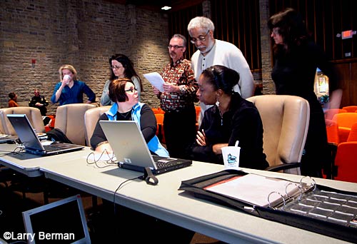
Katie Lucas giving last minute instructions to the
jurors |
|
 |
|
 |
| The room was too dark to capture detail in
the projected images and see what the jurors were doing. I purposely
overexposed so you could see the jurors at work |
| Donate to
BermanGraphics |
|
other art
show jury reviews |
|
Hire me
to Prepare your Digital Jury Images |


