Designing a Postcard

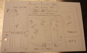
Sometimes The obvious isn’t so obvious. The original postcard layout (see picture at bottom) called for five images, the Niche award logo and a web site URL. Way too cluttered and nothing could be seen clear enough to be a strong image. I redesigned using the two most important images against a background picked up from one of the images. Still not a strong card because the images filled the space awkwardly, just like the five images had. Tried a black background and that didn’t improve the card at all. Finally decided on just the most important image against the black background. Still didn’t work because all the images had been taken by me against a graduated background so there was a gray graduated border against the black.
I finally arrived at what you see above. I took the most important image and enlarged it so that it completely filled the card. Then I rotated it to make it more interesting and dropped in the Niche logo and web site URL text, giving them both a drop shadow and the text a stroke (black line) to make them stand out on the glass book. Yes, Donna Branch creates glass books that are beautiful to look at and a pleasure to hold.
If asked, I recommend using Modern Postcard because they provide a CMYK color profile on their web site. That gives your card a better chance of having accurate color.