 |
|
|
|
Support
BermanGraphics |
|
|
| |
|
Digital Jury Resources |
|
Hire me
to Prepare your Digital Jury Images |
|

|
|
6 booths in 3 years
Improving the Art Show Booth |
|
more booth
articles |
| Sometimes it's like pulling teeth to get artists to make
changes to improve their booth. But once improved, the benefits are
twofold. A more professional looking booth leads to better sales. And the
photograph of a better looking booth leads to getting into better
art shows. |
| The sequence of booth pictures below were sent to me over
a three year period. In each case, you're either seeing a
picture I've improved or a picture that I've rejected and asked the artist to try again.
The captions are under each picture. |
|
Which picture if any, reminds you of your booth? |
|

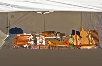
#1 - the booth picture when I started working with
the artist.
it wouldn't be fair to show the original
because
it was taken with the premise that it would be improved |
|

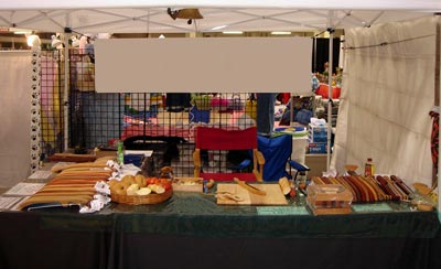
#2 - the back was open and the walls bare.
I had to take the artist's name out of the sign. |
|

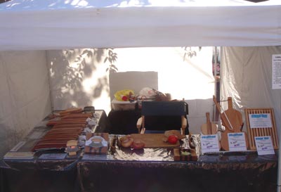
#3 - not an improvement over existing booth pictures
strong backlighting and too many identifying price signs. |
|

#4 - Best so far but doesn't show three walls
and uses
tables with table cloths. |
|

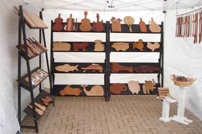
#5 - nice shelf units but the white walls can be
improved. |
|

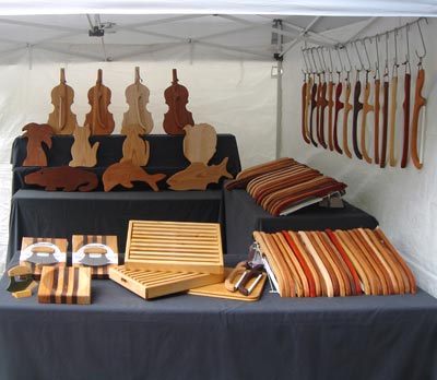
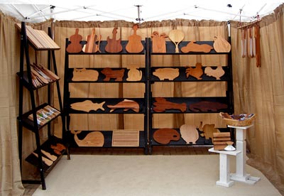
#6 - coordinating fabric behind the shelf units are an improvement. |
|
It's too bad it took so long to get to #6. Imagine the
shows the artist might have been able to get into with a better looking booth and
a better looking booth picture. I still think that
there's room for improvement and I'll be pushing him to improve even more
in the future. Artists should be constantly thinking about improving their
work and display. Otherwise they stagnate and stop growing. |
|
|
|
Digital Jury Resources |
|
Hire me
to Prepare your Digital Jury Images |


