Columbus Open Jury 2014
Columbus open jury February 8-9, 2014
Not more than about a dozen artists attended the first day. No matter how much we stress how important it is to attend an open jury to see both your presentation and what you are competing against, artists are just not taking advantage of this. The second day about 20 artists attended, probably to see if they made the second round.
I’ve said this over and over. It’s about your images. Even more so if your artist statement isn’t read to the jurors.
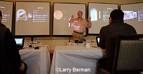
3 second preview slide show followed by 6 second slide show while scoring by medium. Five jurors scored 1-7 without the option of a 4.
Images were almost screen filling on 6 foot projection screens. There were a few obvious cases where 1400 pixel images had been uploaded because those images projected much small than the rest of the images in the presentation. ZAPP is still adding wider 1920 black borders to smaller images when you apply to a show that projects the images for the jurors.
Prior to the preview slide show and jury slide show, the category description from the application prospective was read out loud. There was no artist statement read for round one which resulted in about a 50% elimination. It was only about the images. The no statement being read was the most confusing for the mixed media categories where you had no idea what you were looking at.
The first category was metal and a jeweler applied in that category. It was verbally pointed out to the jurors that some artists might apply in the wrong category to possibly game the system and to score accordingly.
Artwork photographed on white backgrounds made it difficult for the jurors to see detail. I’ve been saying this over and over for ten years now. But the worst was a glass artist with transparent and translucent parts of their pieces. The white background made it difficult (in under 10 seconds) to see how the pieces were constructed because of the bright white through both clear and areas with cut outs.
Fiber and leather categories. If models were used, the faces and eyes were where the jurors (my) eyes went first. That made objective jurying difficult because of the time constraints. There was one wearable leather submission where the model was laying on here back with a leather ornamental neckpiece around her neck. But because her hair was spread out taking up about a third of the image, you couldn’t even find what was leather in the image until it was too late to see what it was.
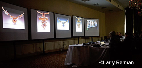
There were some artistically created compositions of objects but it was difficult to appreciate the photography. For example a leather designer had three of the same bags in different colors with one facing the camera head on. The straps were intertwined artistically but in such a short period of time it didn’t come across as well as it should have. Larger screen filling pictures of the objects were easier to read and probably jury.
Any text on the image was either too small to be read or took up too much time in the few seconds the jurors had. And artists should TURN OFF the embedded date in their camera or at least photoshop it off the images. The few times images like that came up a humorous comment could have been made that at least you know it’s current work.
It was disturbing for me to see objects floating in mid air, objects that had been cut out and dropped into a background with no shadowing which would have made it look real.
When black was a large part of the artwork, not artwork photographed on black, there needed to be a separation between the black part of the artwork and the black borders or the rest of the projection screen. If the black area touches the edge of the artwork I suggest adding a light gray stroke or border around the art so the jurors can understand the parameters of the art without spending additional time evaluating it.
Artist statements were read for round two. I’ve always said that photographers write the worst artist statements, always discussing their output. I can’t remember how many times I heard limited edition of no more than (fill in the number) printed archivally. Painters had the second worse artist statements. Most limited it to three or four words, like “oil on canvas” or something similar.
The booth. Like all the other juries, there were a great many bad booth pictures. Unfortunately there was a few times that I was seeing some interesting artwork but I knew they would not get past the jury because of a really cluttered booth picture.
I should let people know that the image issues I pointed out didn’t necessarily keep an artist from advancing to round two. They just prevented the images from being read more easily in the short period of time round one lasted.
I’ve been doing this long enough now that a significant percentage of each show’s submissions contain images that have gone through my computer. It was good to see that those images looked really good with no distracting elements. And like I said in the beginning, with no words to support or explain what you do, and in such a short period of time that they judge you, it’s only about the images.
You can read more jury reviews and interviews with jurors on the web site.