 |
|
|
||||||||||
 |
||||||||||
| How To Prepare Images For The Web by Larry Berman This copyrighted article was prepared for e-Digital Photo magazine and may not reproduced |
||||||||||
| After twenty five years of selling my Fine Art
Photography on the national Art Show circuit, I've found it a natural
evolution to move from the chemical darkroom to the digital darkroom. In
1998 I
purchased a computer and hired fellow artist Chris Maher to build a web site for
me. Being short on time, he agreed to do it if I would learn how to
prepare the images. This started a working relationship that grew into a
partnership. We now specialize in building "image intensive" web sites for
photographers and artists and have established a reputation for creating web
images that are true to the original artwork. Knowing that the
higher the image quality, the larger the file size, the slower the page
loads, I've
made it my objective to create rapid loading, good looking images in
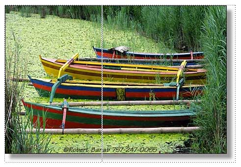
small file sizes. My personal system consists of a Dell Pentium III at 550 MHz, with 384 megabytes of ram running Windows 98 SE. I use a Matrox G400 graphics card that features dual monitor support with a 21 inch Sony monitor to work on the images full screen and a 13 inch Sony monitor for my Photoshop tool pallets. For scanning I use a Polaroid Sprintscan 4000 for slides and an Epson 1200S for prints. I also use a 4x5 transparency adapter for my print scanner for the few times I've only had large format transparencies to work from. I've found it adequate for the web, especially since it's a $99 alternative to a $7500 investment. The programs I use most are Photoshop 5.5 for image editing and ACDSee for image management. While working, I leave ACDSee open in thumbnail view on my second monitor, and drag images into Photoshop or my web design program. The initial approach is to discuss with the artist, in detail, their expectations and what their options are for the site. I need to consider the page background color and image size before I begin. I always ask about the client's monitor and screen resolution, so I can visualize how they are going to view the web site. In preparing the image I add a single pixel stroke (line) around the image so it stands out on the page. For instance, if the page color is black, I will use a white stroke so the dark areas of the image will still stand out. If the page color is to be white, a black stroke and maybe a drop shadow will be used, so it looks as if the image is hanging on a wall. I usually recommend sizing the image to 450 pixels long dimension. That size is big enough to see clearly, but not too big that printing it out would replace a sale. At 72 pixels per inch, it will only print out to 6 ¼ inches (long dimension). The last thing I do before working on the images is to determine how the client wants the copyright to read. As a security measure, I recommend adding a copyright, as a text layer in Photoshop, to every picture. Ideally it should be the URL of the web site. This way, if someone prints the picture out, one day they might want to purchase the real picture, and will know how to contact the artist. Another security measure I've used is to slice the image. Each image then loads in pieces, making it harder to capture. If the client gives me 35 mm slides, I scan them at 1200 dpi. When I work from prints, I scan them at 300 dpi. In keeping all my work files organized, I create multiple folders under each clients name so I can save at every step of the way. I run all my image processing on the original scanned size Photoshop (psd) file. I never do any batch processing which affects image quality, taking each image as a separate entity for the best results.
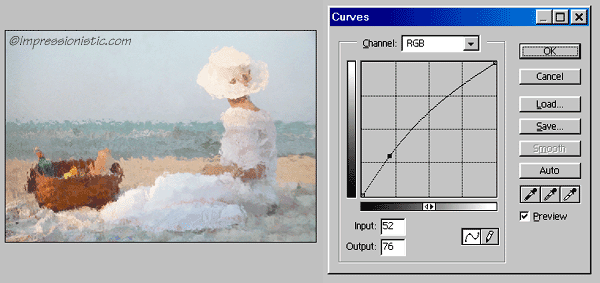
Having the slides or prints to work with gives me a guide to match for color. I use curves to open the shadows so the image on the computer will look like the print (or painting) the artist is selling. Then I resize the image by adjusting the height or width (whichever is longest) to 450 pixels. I run the unsharp mask filter to bring back the sharpness lost by resizing and add a text layer with the copyright. I save at this point by adding the size to the file name (450-picture01.psd). Note the text is still an active layer (not flattened), so it can be edited in the future. Next I flatten layers and add the single pixel stroke and save again. I am careful here to add an "s" to the file name for stroke (450s-picture01.psd). If the pictures require a drop shadow, this is the point where it will get added. If not, my next step will be to convert it to a jpeg for the web. One of the new features that made it worth upgrading to Photoshop 5.5 is a great jpeg conversion called "Save for the Web." It gives a side by side comparison between the original Photoshop file and the resulting jpeg. This way you can actually see the image quality change as the file size is lowered and know how much you can get away with or how small you can make the file size before the picture shows signs of jpeg artifacts. I try to keep all my file sizes to under 40 kilobytes, and most end up between 18 and 30 kilobytes. When constructing the web site, I use only one image per page to maximize the chances of a sale. This way the page will load quickly, and the viewer is not distracted. The thumbnail galleries, which consist of multiple images of the same theme, are either 175 or 200 pixel images (again, long dimension). I generally limit the number of images to 12 for faster loading. All the images are then archived to CD, with both my partner and I maintaining copies. |
||||||||||
|
To Summarize
|
||||||||||
| This copyrighted article was
prepared for e-Digital Photo magazine and may not reproduced |
|
All photos on this site are available for stock or
fine art sales |
| Slide scanning for ZAPP and other digital jury systems |
|
1970s ABA and NBA
Basketball photographs |
|
Web site content © Larry Berman |
Larry
Berman
|


